Before We Talk About OP Reports, We Need to Talk About Excel
OP Reports is a useful tool to get raw data about your practice, but it’s not a full-featured spreadsheet program. It doesn’t make pretty bar graphs, compute running averages, or have a cool point-and-click interactive interface.
Microsoft Excel, however, has powerful data analysis features; it’s nearly ubiquitous on office computers, and there are hundreds, if not thousands, of free Excel tutorials and help sites on the Internet.
There’s certainly no reason that OP Reports should be expected to duplicate the rich features of Excel. In fact, even for very simple data analysis, OP Reports novices may find that it’s faster and more effective to: use OP Reports to quickly get a lot of raw, unformatted data, then dump the OP Report to Excel, to do more sophisticated transformations, like sorting, merging, averages, sums, etc.
If you don’t know much about Microsoft Excel, you will probably find it beneficial to do some basic Excel tutorials before you start learning about OP Reports.
If you already know a lot about Excel, you can probably skip most of this lesson.
If you really hate Excel and don’t like to use it – then your OP Reports experience will be even more unpleasant. Sorry.
Making the Most of Microsoft Excel: Basic Excel Functions
If you are not familiar with Excel, you may want to work through some of its basic tutorials first. There are so many free Excel tutorials available that there’s no point in reproducing them all here. Even if you’re fairly seasoned in Excel, spending a few moments reviewing key functions might remind you of some time-saving shortcuts (particularly in regards to your practice’s data analysis.)
Obviously, the tutorials may not be precise depending on which version of Excel you are using.
PivotTables
PivotTables are a simple, elegant way to convert raw Excel data dumps into organized, meaningful summaries.
For example, let’s say we need to turn in Meaningful Use data to our state’s Medicaid Bureau. We need a report that shows, for the period 1/1/15 through 12/31/15:
- How many different face-to-face paid Medicaid encounters we had during the year
- Who the provider was for each encounter
- What the patient’s Medicaid MCO was
- The total paid by Medicaid for that DOS
We can make a fairly simple OP Report that prints out several pages of this:

We can figure out which Medicaid MCO they were in based on their Medicaid ID number — kids with JD prefixes are in plan #1, and kids with ZECM prefixes are in plan #2. We might have to clarify whether the Medicaid agency wants “provider” to be rendering provider or billing provider. We don’t have to report the patients’ ID numbers or their dates of service, so we can probably delete those columns.
The report needs to include grouped totals. For example, the Medicaid agency might want to know the total in Medicaid plan #1 who saw rendering provider CLR. We certainly don’t want to go through 50-100 pages of this and manually count up how many saw each provider, subdivided by plan.
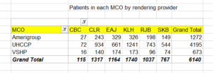
But in under 5 minutes, using Pivot Tables, we can make a report that looks like this:
…and everything is nicely summarized in chart form, enough to satisfy the pickiest Medicaid bureau.
VLOOKUP
The VLOOKUP Excel function is useful for comparing the contents of two lists or tables to find elements in one table not contained in the other.
Let’s say a managed care organization sends you a long list of the patients that are assigned to your panel, according for whom you are the PCP:
|
Patient |
DOS |
Insurance ID |
|
Jeremiah Wilson |
9/1/2007 |
MCO84870291 |
|
Frank Galloway |
12/9/2013 |
MCO93840222 |
|
Ping Chen |
4/14/2012 |
MCO03934810 |
|
Mary Gomez |
3/23/2003 |
MCO83849827 |
OP Reports can easily create a list of your practice’s active patients with that particular insurance. It does have some overlap with the MCO’s list. However, it doesn’t match exactly:
|
Patient |
DOS |
Insurance ID |
|
Jeremiah Wilson |
9/1/2007 |
MCO84870291 |
|
Frank Galloway |
12/9/2013 |
MCO93840222 |
|
Dinah Grayson |
3/21/1999 |
MCO92835710 |
|
Joseph Washington |
7/15/2009 |
MCO14856514 |
Both you and the MCO agree that Jeremiah and Frank belong to your practice. Mary Gomez is no longer your patient; she moved away. Ping Chen has never been your patient, as far as you know. Dinah Grayson and Joseph Washington recently became part of your practice, and the MCO doesn’t have them attributed to your practice yet.
Sometimes, for P4P purposes, it’s useful to reconcile two medical home lists and find those in one list not present in the other (and vice versa). Instead of laboriously comparing the two lists one-by-one, the VLOOKUP function can be used. It can check to see if one name (or ID number) from one list is present in another list. You can then use the results to create sub-lists, like these:
|
Our patients, and MCO agrees |
MCO thinks are our patients, but we say no |
Our patients, but MCO doesn’t think so |
|
Frank Galloway |
Ping Chen |
Joseph Washington |
|
Jeremiah Wilson |
Mary Gomez |
Dinah Grayson |
The MCO can reassign the 2nd list of patients off your panel and move the 3rd list of patients onto your practice’s panel.
Conditional Formatting
Conditional formatting is useful in that it can quickly make certain data points “pop” in a very large spreadsheet. For example, you can highlight duplicate rows in yellow; make dollar values that are below average appear in red; flag dates that are older than a specified threshold in orange.
Converting a Column of Text to a Column of Numbers
OP Reports tends to export all data as strings rather than numbers. This is fine for numbers that you aren’t going to do any arithmetic with. For example, you’d never need to average zip codes or need to sum the chart numbers of the patients seen today. But some numbers, like dollar figures, you might want to sum or average.
Here is an example of an OP financial report exported to Excel.

See the little green triangles in columns F, H, and I? These show that Excel is treating those cells as text values, not number/dollar values. If you try to sum/average these fields, it will give an error message.
Thus, we want to change all the dollar values columns (F, H, and I) to actual values, not just texts.
Now it looks better. No more green triangles, and you can manipulate the dollar data to your heart’s content:

COUNTIF and SUMIF

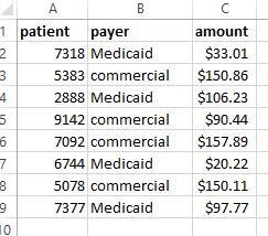
Let’s say we have some claims payment data like this, and we want to get some statistics on it. However, we’re interested in separately evaluating Medicaid payments from commercial insurance payments. We can use commands like COUNTIF and SUMIF to answer questions like:
How many Medicaid payments are there in this group?
What is the sum of the commercial payments in this group?
What is the average Medicaid payment in this group?
You can also use the COUNTIFS, SUMIFS, and AVERAGEIFS functions to add more than one criterion.

