Creating OP Reports: OP Report Builder Tools
See this lesson in video form
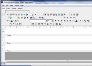
Laying out the elements of the report – fields, graphics, fonts, colors, and more — are all done on the Design tab of OP Report Builder.
Elements on the Report
The user interface for the Design tab of Report Builder is fairly straightforward. In general, left-clicking a report element will select it; left-clicking and dragging will move it around on the page; right-clicking an element will bring up a menu that will allow editing of its attributes.
All the tools for laying out the report are found in the blue rectangle on the Design tab, just below the Menu bar and the Construction tabs:
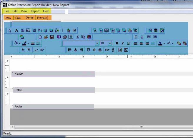
The component toolbars have several groups of tools which can be hidden/made visible or docked/undocked.
To make a tool group visible in the Design tab, go to View on the menu bar, then Toolbars, then select the tool group you want. Selecting a checked tool group will make it invisible again.
To move or undock any tool group, click and drag in the two grey vertical lines on the left side of that tool group (highlighted here in red):
The groups of tools are listed below. The tools in each group are listed in the order they appear in the group, from left to right.
Standard Components tool group |
Select Object | Label | Memo | WPTools | SystemVariable | Variable | Image | Shape | Line | BarCode | Checkbox |
|
|
Select Object |
The go-to tool for selecting, grabbing, moving, grouping, etc. |
|
|
Label |
Enter small bits of static text onto reports. Used for creating header text, footer text, X’s for marking check boxes, captions, and so on |
|
|
Memo |
Enter large paragraphs of static text into reports. Let’s say you want to create a bunch of dunning letters for deadbeat families. The variables are pretty brief – guarantor name, address, total family owed. But you have two or three longish paragraphs of static text about how the family needs to contact you or set up a payment plan and how you hate to send them to collections but you might have to, etc. You could create a bunch of Labels for this, but arranging them all takes a lot of tedious clicking. A Memo field lets you import long sections of pre-prepared text. You create your dunning letter paragraphs in a plain .TXT file, then create the Memo field and link it to your PAYUP.TXT file. |
|
|
WPTools (RichText) |
Enter blended static and database information, e.g. a combination of Label and DBText. By inserting fields from the REGISTER table, you can produce “Your child was born on <BIRTHDAT> and lives in <STATE>.” It also supports RichText formatting. RichText – like Label, but supports RichText formatting. |
|
|
SystemVariable |
Used to print standard report design variables, like the current date and time or pagination/“Page X of Y” constructions. |
|
|
Variable |
Add a variable whose contents you define and will be calculated on the fly. Read more on how to use variables creatively in Variables as Control Structures. |
|
|
Image |
Add a graphic to your report. This might be a small graphic, like your practice logo on a form or statement, or it might be a page-sized graphic “form blank” (see Importing the Form Image for an example.) |
|
|
Shape |
Add a circle, square, rectangle, etc. graphic to your report. You can customize color, fill, etc. Line – add a line to your report (similar to Shape.) |
|
|
Line |
Add a line to your report (similar to Shape.) |
|
|
BarCode |
Create a 1-D bar code based on static text you specify. CheckBox – create a checkbox which is statically checked or unchecked. |
|
|
CheckBox |
Create a checkbox which is statically checked or unchecked. |
|
Data Components tool group |
DBText | DBMemo | WPTools | DBCalc | DBImage | DBBarCode | DBCheckBox |
|
|
DBText |
This component displays simple, brief information from a database field (like a chart number, a last name, or a dollar value |
|
|
DBMemo |
His component displays much longer text information from a database field, like the Summary of a chart note or the contents of a patient’s Billing Notes field |
|
|
WPTools (RichText) datasensitive | DBRichText |
Essentially the same as DBText, but allows embedded RichText (like a Visit Summary note.) |
|
|
DBCalc |
Used for simple calculations on database data, like Average (of dollars charged per claim), Count (of visits per day per provider), and Sum (of dollars received for each day in March). |
|
|
DBImage |
Show an image from the database. Typically we use this to show an image of the physician’s signature on forms and prescriptions. |
|
|
DBBarCode |
Create a 1-D bar code based on a database variable. For example, you could do this with patient zip codes on mailing labels for faster post office processing.. |
|
|
DBCheckBox |
Check or uncheck a box based on a database variable. |
|
Advanced Components tool group |
Region | Subreport | Crosstab |
|
|
Region |
Create a component that contains other components, to move/stretch all enclosed components together. |
|
|
Subreport |
Create mini-subreports (chapters) within a larger report (book). |
|
|
Crosstab |
Create an interactive PivotTable type grid of data. Crosstabs create visually-appealing spreadsheet-like reports. Making Crosstabs look nice is itself an entire tutorial. Read an introduction to Crosstabs (see PDF page 111.) |
|
Standard tool group |
|
|
This fairly self-explanatory tool group contains icons also found on the File menu bar. |
|
|
New | Open | Save | Page Setup | Print | Print Preview | Cut | Copy | Paste |
|
Format tool group |
|
|
Font & Font Size | Bold | Italic | Underline | Left Justify | Center | Right Justify | Justify |
|
|
Font Color | Highlight Color |
|
Edit |
|
|
This blank rectangle changes to reflect attributes of the highlighted element: text content of a label, drop down options for a shape, etc. |
|
Draw tool group |
|
|
These commands can be applied to a selected line, shape, or region to change its color or style attributes: |
|
|
Fill Color | Line Color | Line Thickness | Line Style |
|
Align or Space tool group |
|
|
These commands can be applied to a group of selected elements (lines, Labels, DBText, etc) to arrange them neatly them neatly into rows and/or columns. The Align Bottom command is necessary to make sure that reports you reports you export to Excel don’t drop data rows (see Lost Data Errors in Conversion) |
|
|
Align Left | Align Middle | Align Right Align Top | Align Center | Align Bottom Space Horizontally | Space Vertically | Center Horizontally in Band | Center Vertically in Band |
|
Size tool group |
|
| These commands can be applied to a group of similar elements (Labels, DBTexts) with disparate sizes to apply a uniform width or height to all the elements. Select the elements first using the Select Object tool, then click on the Size command. | |
| Shrink Width to Smallest | Grow Width to Largest Shrink Height to Smallest | Grow Height to Largest | |
Nudge tool group |
|
| These commands move selected element(s) a tiny amount along the X or Y axis | |
| Nudge Up | Nudge Down | Nudge Left | Nudge Right | |
Bands
Bands are the different horizontal sections of a report.
In the above example, there are three sections, the Header, the Detail band, and the Footer. The white space above each grey band marker is where the actual report piece will appear. The caret ^ reminds you to look up for the corresponding data band. You can resize the height of each area by clicking on the grey band, then dragging it up and down.
You can add additional bands by using Title and Summary, and Grouping. See Special Bands and Grouping.
The status bar shows messages and object positions and other useful information – don’t forget to look down in the corner for helpful information.
Quickstart: Laying Out a Very Basic Report
Once you have a simple report defined in your Data tab, the most basic report will consist of laying out each field using DBText on the Detail tab.
Let’s say here’s the SQL in a report:
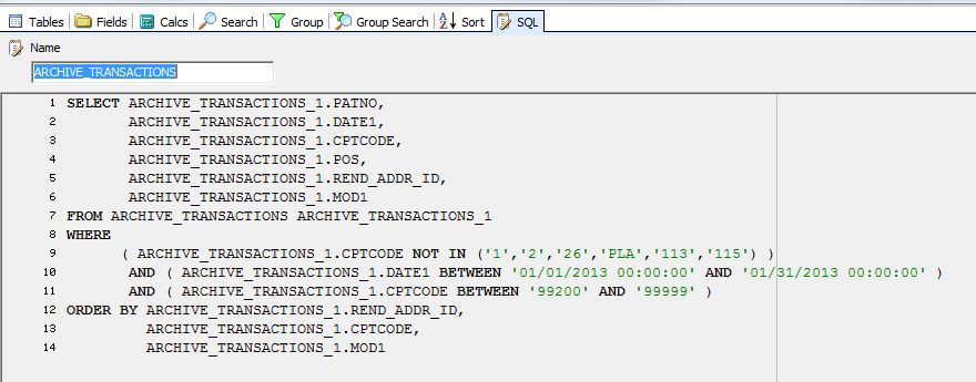
So we want to lay out a report showing six elements: the patient chart number (PATNO), date of service (DATE1), CPT (CPTCODE), place of service code (POS), rendering provider (REND_ADDR_ID), and first modifier, if any, on the CPT code (MOD1).
From the Design tab, click the DBText tool (highlighted):
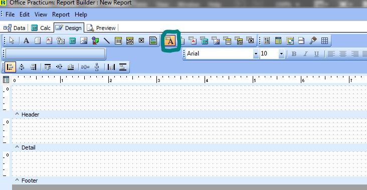
Then click in the white grid in the Detail band at the site where the first data element (the patient’s chart number) should go. It shows the default name of this data element, DBText1:

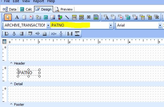
Then, with DBText1 selected as shown above (you can tell it’s selected because of the 9 open circles around the perimeter of the element), click on the dropdown (highlighted yellow, below) that’s blank and set it to PATNO. This assigns the DBText1 element to show the PATNO field. (You could have just as easily set it the dropdown to DATE1, for example.)
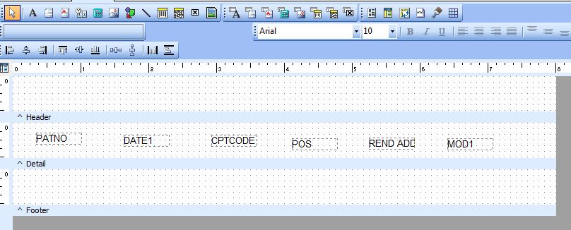
Continue clicking the DBText tool from the Design tools and clicking the Detail grid layout until you have six elements. Then, using the drop down, assign each of them one of the fields you want to show in the report:
Ctrl-Z, as in many Windows applications, allows you to undo the most recent command if you make a mistake.
You’ll want to horizontally align the 6 elements so that it looks nice and you don’t have dropped rows (see Lost Data Errors in Conversion). You can select all 6 elements with the Select Object tool (which looks like an Arrow) by dragging a rectangle around all the elements. The dark grey dots at each corner of each element show that all six elements are currently selected :

Then after clicking the Align Bottom tool from the toolbar, they are neatly aligned:
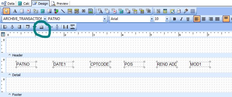
To add explanatory text to the Header band, click on the Label tool (green circle) on the toolbar (which looks like the letter A.) Then click the location in the Header grid where the text should go (red circle).
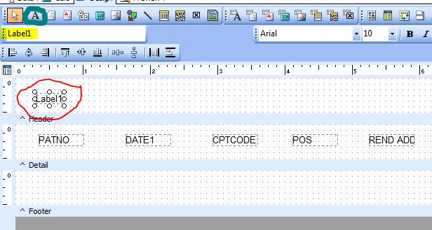
By entering text in the Set Value text box (highlighted yellow), you can change the label to explain what to expect in your report. Continue adding labels and editing their text until your header looks appropriate:

To see what your newborn report looks like, click on the Preview tab. Don’t forget to periodically save your work!
